Published on: October 19, 2023, 08:10h.
Last updated on: October 19, 2023, 08:10h.
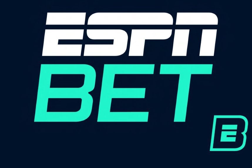
ESPN Bet, the upcoming sports betting platform, is taking a unique approach with its logo design. Unlike the iconic red coloring associated with ESPN, the sportsbook will feature a vibrant mint color. However, the ESPN lettering in the ESPN Bet logo will still use the cable network’s famous italic Stop font with a horizontal white strip running through the letters.

ESPN Bet is an exciting collaboration between Penn Entertainment and ESPN’s parent company, The Walt Disney Company. Through this partnership, ESPN will provide the sportsbook with marketing services, brand recognition, and other rights.
In a surprising move, Penn Entertainment decided to end its association with Barstool Sports, a network it acquired for over $500 million. This decision was made due to extensive regulatory scrutiny and concerns raised by state gaming regulators regarding the suitability of Barstool founder Dave Portnoy to hold a gaming license. As part of the deal with ESPN, Penn Entertainment sold Barstool back to Portnoy for just $1.
Debut Logo Revealed
In preparation for its upcoming launch in November, ESPN Bet has unveiled its debut logo. The sportsbook plans to go live in 16 states, including Arizona, Colorado, Illinois, Indiana, Iowa, Kansas, Louisiana, Maryland, Massachusetts, Michigan, New Jersey, Ohio, Pennsylvania, Tennessee, Virginia, and West Virginia.
According to ESPN Bet representatives, the brand’s logo represents a welcoming, inclusive, unexpected, and fun identity.
The brand itself features the universally recognizable ‘ESPN,’ while the sportsbook app will be branded with an ‘E’ within the ‘B,’ showcasing the idea that ESPN, in partnership with Penn Entertainment, is launching a sportsbook for fans while maintaining ESPN’s trusted brand image,” said ESPN Communications Director John Manzo.
Manzo also stated that ESPN Bet will launch a comprehensive marketing campaign across various ESPN platforms, including apps, digital, social media, and television programming.
Logo Evolution
Since its implementation in 1985, the ESPN logo has undergone minimal changes. The previous logo featured red letters in a Stop font, surrounded by an orange oval. The current logo still maintains the red letters and Stop font but with a brighter shade of red and an italicized design.
Graphic designers at the creative ad agency Kreafolk praised the ESPN logo for its distinctive font, clever angling, and the creative use of a crossing line, calling it an iconic design that transcends time.


